ORA ClientTalk

Reducing cognitive load in AI-assisted compliance decisions through semantic data visualization

Timeline

January 2025 - May 2025

Company

Mentivista (Client: ORA Space), an AI-powered LMS for beauty & wellness businesses. This project focused on the 'Shadowing Training' feature, enabling managers to review transcripts and coach sales representatives on compliance and empathy.

Role & Team

Founding product designer, collaborated with 1 PM, 1 AI Engineer, and 2 Software Engineers.

Responsibility & Collaboration

First design hire, led the end-to-end redesign and architected the semantic decision interface for AI-driven risk and empathy auditing in regulated workflows.

With PM, defined MVP strategy and scope by prioritizing the visualization of invisible FDA risks and soft-skill gaps to ensure regulatory compliance.

With AI/Software engineers, built a Semantic Design System, mapping latent model outputs into a deterministic visual hierarchy to translate opaque data into actionable heuristics.

Impact

Decision Validation Effort

↓ ~85%

backtracking

Reduced re-reading and manual verification by anchoring insights.

FDA Compliance Miss Rate

↓ Near 0

during monitored period

Lowered downstream risk from audits and regulatory remediation.

Operational / Coaching Velocity

↑ 3.5 x

Enabled managers to move from review to action significantly faster.

Hover screen to see old design ↓

Project Background

When AI outputs data, managers still make decisions.

AI-powered coaching tools speed up review, but in regulated environments, speed without decision structure creates risk.

At ORA, managers reviewing long transcripts still had to manually distinguish critical FDA risks from minor coaching feedback, even with speech-to-text and AI evaluation in place.

The issue was not data or model accuracy, but the absence of a decision structure that made priority, risk, and accountability explicit.

The Challenge

Designing a decision system managers could trust in high-risk, regulated workflows.

How might we…

  • Help managers instantly distinguish critical compliance risks from secondary coaching feedback?

  • Reduce the cognitive load of validating AI judgments without hiding important context

  • Transform opaque AI output into decisions that are explainable, auditable, and defensible over time?

Below, you’ll see how I approached each of these challenges, and how the system evolved from a flat data dump into a structured, inspectable decision surface.

Below, you’ll see how I approached each of these challenges, and how the system evolved from a flat data dump into a structured, inspectable decision surface.

Key Improvements

1

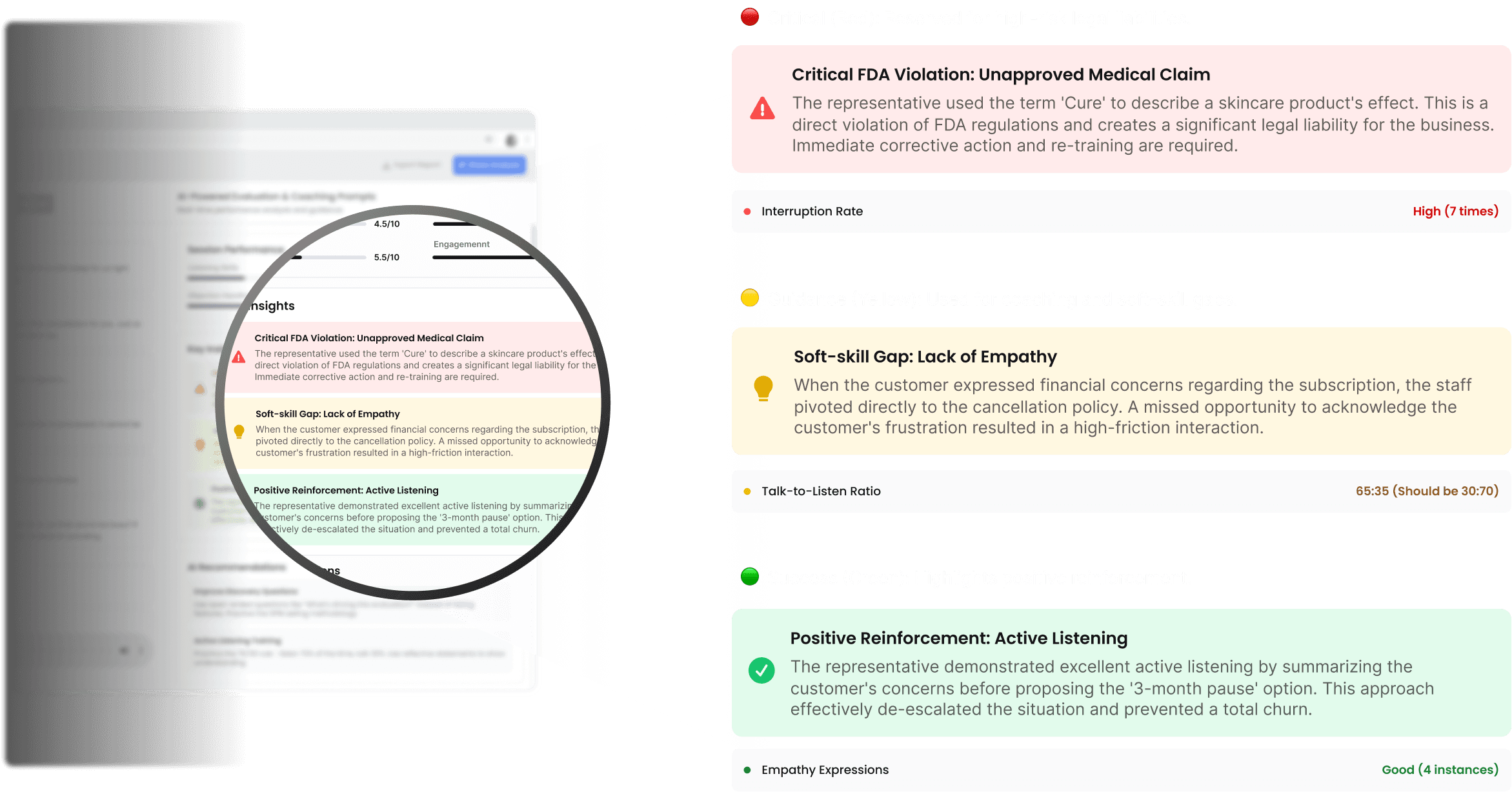
3-Layer Semantic System for Risk Prioritization

By introducing a strict 3-layer semantic token system,
we transformed flat AI output into a prioritized decision surface.

2

Context-Anchored Interaction for Evidence Validation

We physically connected each AI insight to its exact supporting evidence in the transcript.

User Pain Points

Managers struggle to distinguish critical FDA risks from minor soft-skill gaps due to flat, unhierarchical data.

"The scariest part is that a serious FDA compliance looks exactly like minor coaching feedback in the report. When I’m busy, I’m terrified I’ll skim past something that could actually get us in legal trouble."

Senior Med Spa Manager

“I spend more time trying to understand what actually matters than fixing the problem itself. I end up re-reading the whole transcript just to feel safe."

Regional Manager, Aesthetics Clinics

“There’s no hierarchy at all. Everything is flagged the same way. I still have to mentally rank what’s dangerous, what’s important, and what can wait."

Compliance Lead, Wellness Clinic Group

Business Goal

Maximize coaching velocity by restructuring AI output into a decision-first system that prioritizes legal risk over secondary feedback.

System Re-Architecture

I re-architected the system around a decision-first structure that explicitly encodes judgment, rationale, evidence, and decision context over time.

Design Exploration
  1. Semantic Clarity — Traffic Light System

1) Trade-Offs

1st Decision

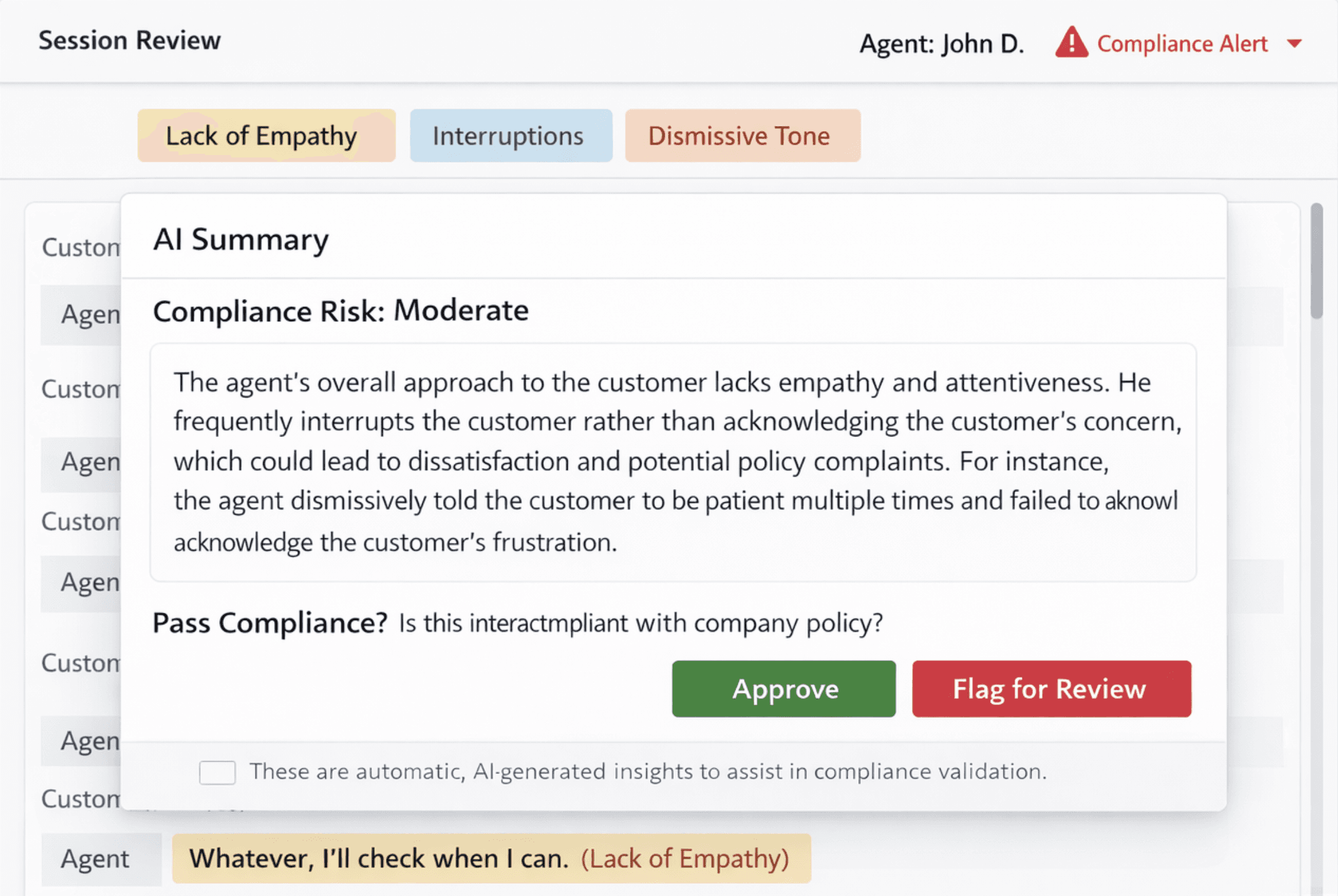
Highlighting everything the AI flagged

⚠️ Why It Failed

  • There were many highlights, but it was still unclear why the conversation was considered problematic.

  • Labels like “Lack of empathy” were abstract, with no explanation of what specifically made them empathetic or not.

2nd Decision

Letting the AI Explain Itself in a Paragraph

⚠️ Why It Failed

  • The summary still felt like another opaque AI output, with no reliable way to audit or challenge specific claims.

Final Decision

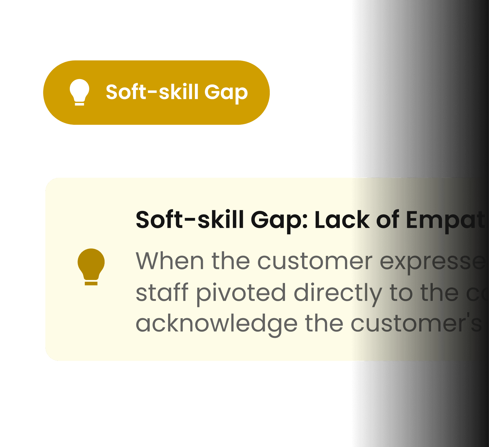
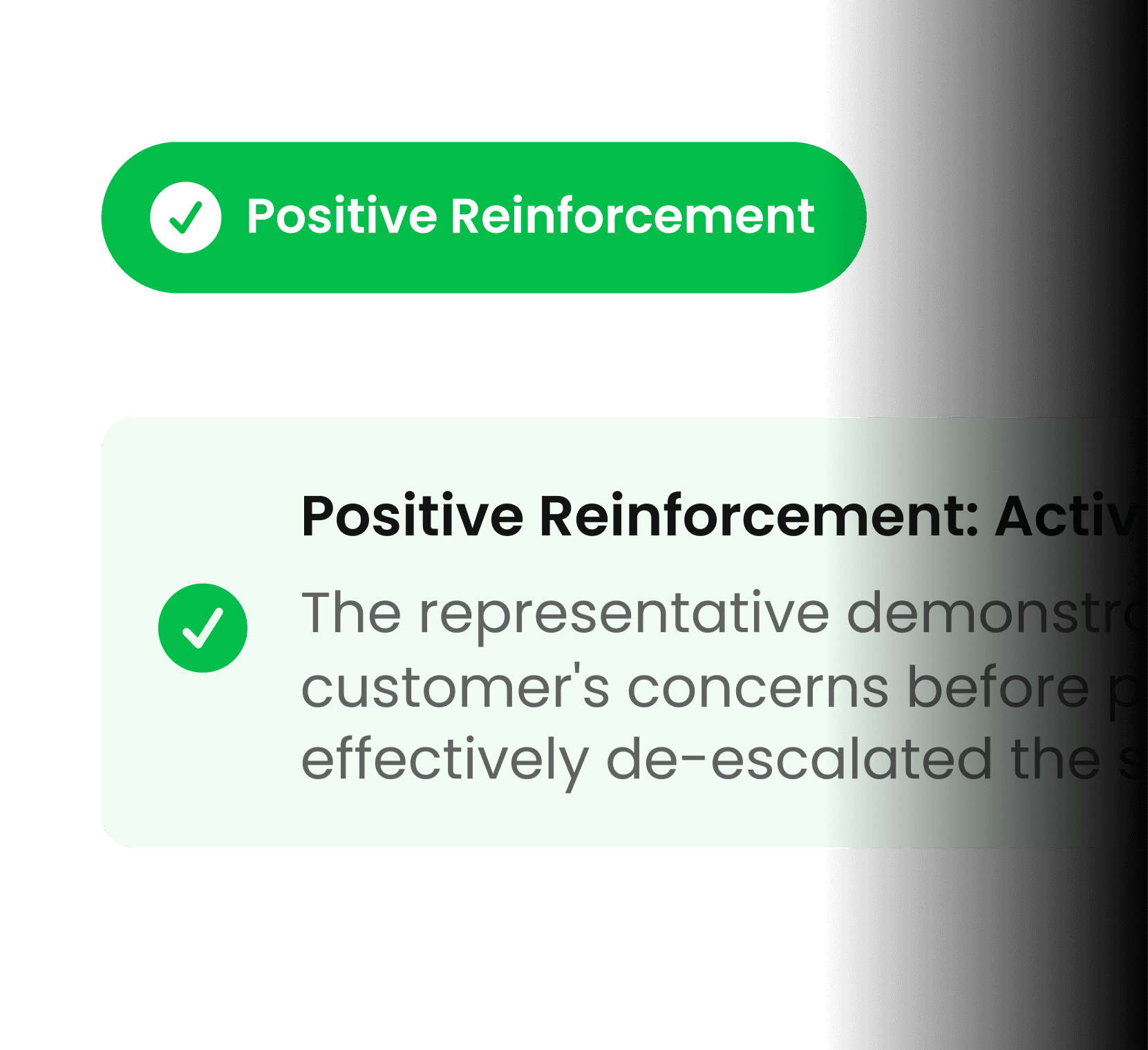
Structuring AI Feedback into Semantic Tokens

✅️ Why It Worked

  • Reduced cognitive load by converting abstract AI labels into structured, human-readable reasons that managers could evaluate without scanning the entire transcript.

  • Improved trust calibration by turning opaque AI judgments into explicit, debatable claims instead of unverifiable summaries.

  • Turned abstract AI feedback into an inspectable, debuggable decision surface.

2) Design Decision

Full-background colors created alarm fatigue when everything is emphasized, nothing stands out, so I pivoted to a minimalist token system.

Rejected

✅ Selected

3) Final Design

3) Final Design

Visualizing the Invisible Weight of Information

From Flat List to Hierarchical Cards. Previously, a critical FDA violation looked the same as a minor typo. I implemented a Semantic Color Token System to instantly signal urgency without requiring managers to read the details first.

From Flat List to Hierarchical Cards. Previously, a critical FDA violation looked the same as a minor typo. I implemented a Semantic Color Token System to instantly signal urgency without requiring managers to read the details first.

3) Final Design

Visualizing the Invisible Weight of Information

From Flat List to Hierarchical Cards. Previously, a critical FDA violation looked the same as a minor typo. I implemented a Semantic Color Token System to instantly signal urgency without requiring managers to read the details first.

  1. Bridging Validation Gap — Context Anchoring

1) Observed Behavior : The Scroll-Hunting Loop

Unlike binary FDA violations, feedback like 'Lack of Empathy' is abstract. We observed managers reading the transcript up and down repeatedly to judge if the AI's assessment was fair. This caused a massive validation gap.

2) Technical Tradeoff

Why "Timestamp Indexing"? Solving the 60fps Rendering Gap

⚠️

Initial Approach

Performance Bottleneck

Injecting styles and events into every DOM element across thousands of lines caused severe rendering lags and browser memory bloat during real-time session reviews.

Tradeoff

Solution

Used a Virtualized List and timestamp indexing. This simplified engineering complexity by replacing heavy DOM manipulation with a 'Jump-to-Index' logic.

3) Final Design

Bridging the Gap Between Insight and Evidence

One Click, Instant Context. I designed the 'Auto-Scroll & Highlight' interaction. Clicking an evaluation card instantly navigates the transcript to the exact timestamp, visually connecting the Result (AI Insight) with the Cause (Raw Data).

Appendix - Governance Extension

Extending trust beyond individual decisions by preserving authority, context, and accountability over time.

Performance trends encode the stability of managerial decisions.

  1. Performance trends encode the stability of managerial decisions.

Scores are interpreted in the context of repeated managerial judgments, preventing single-period variance from distorting longitudinal performance evaluation.

Consistency of judgment, not point-in-time scores

Evaluation logs function as an audit trail, preserving decision authority over time.

  1. Evaluation logs function as an audit trail, preserving decision authority over time.

Manager transitions are explicitly preserved to ensure historical judgments remain attributable and interpretable across organizational changes.

Traceable authority and accountability per decision

Accessibility & Inclusive Design Guide
  1. Visual & Semantic Accessibility

Double-coding for color blindness

By pairing color with distinct iconography, I created a fail-safe system where critical information is conveyed through both hue and shape.

WCAG 2.1 Contrast Standards

All UI elements adhere to strict contrast ratios to ensure legibility for low-vision users.

Invisible Hierarchy (Screen Readers)

I translated visual importance into structural code using Semantic Markup & ARIA Labels. By utilizing aria-live="assertive", I ensured screen reader users perceive the same urgency for critical risks as sighted users.

  1. Motor & Keyboard Accessibility

Full Keyboard Operability

Every interactive component is navigable via standard shortcuts (Tab, Enter, Space, Esc, etc.), eliminating the dependency on mouse or touch input.

Touch Target Optimization

For mobile and touch interfaces, I established a minimum hit area of 44x44px to reduce accidental triggers and improve accuracy for users with motor impairments.

Enhanced Focus States

To prevent "losing the cursor," I implemented a required 2px high-contrast outline with a ring offset for all focused elements, ensuring visibility across both light and dark modes.

Design System

Design System for Reliable, Actionable Signals

Semantic Tokens define urgency, risk class, and decision weight

Component States preserve rationale and evidence linkage.

Accessibility Semantics ensure urgency is perceivable across modalities.

Retrospective & Conclusion

This project reinforced that in AI-native systems, trust is not earned through model accuracy alone, but through semantic structure. By encoding urgency, evidence, and accountability into a 3-layer token system, I transformed opaque AI output into a decision surface managers could safely act on—without slowing down high-risk workflows.

Enter password to view case study

  1. Bridging Validation Gap — Context Anchoring

1) Observed Behavior : The Scroll-Hunting Loop

Unlike binary FDA violations, feedback like 'Lack of Empathy' is abstract. We observed managers reading the transcript up and down repeatedly to judge if the AI's assessment was fair. This caused a massive validation gap.

2) Accessibility

Double-Coding for Color Blindness

By pairing colors with distinct icons, I created a fail-safe system where information is conveyed through both hue and shape.

Invisible Hierarchy for Screen Readers

Translated visual importance into Structural Code (Semantic Markup & ARIA Labels), ensuring that screen reader users perceive the same urgency for critical risks as sighted users.

3) Final Design

Bridging the Gap Between Insight and Evidence

One Click, Instant Context. I designed the 'Auto-Scroll & Highlight' interaction. Clicking an evaluation card instantly navigates the transcript to the exact timestamp, visually connecting the Result (AI Insight) with the Cause (Raw Data).

2) Technical Tradeoff

Engineering-Driven Design: From Flat to Modular

Performance Bottleneck

Injecting styles and events into every DOM element across thousands of lines caused severe rendering lags and browser memory bloat during real-time session reviews.

⚠️

Initial Approach

Solution

Used a Virtualized List and timestamp indexing. This simplified the engineering complexity by replacing heavy DOM manipulation with a deterministic 'Jump-to-Index' logic.

Tradeoff

Accessibility & Inclusive Design Guide
  1. Visual & Semantic Accessibility

  • Double-coding for color blindness

By pairing color with distinct iconography, I created a fail-safe system where critical information is conveyed through both hue and shape.

  • WCAG 2.1 Contrast Standards

All UI elements adhere to strict contrast ratios to ensure legibility for low-vision users.

  • Invisible Hierarchy (Screen Readers)

I translated visual importance into structural code using Semantic Markup & ARIA Labels. By utilizing aria-live="assertive", I ensured screen reader users perceive the same urgency for critical risks as sighted users.

  1. Motor & Keyboard Accessibility

Full Keyboard Operability

Every interactive component is navigable via standard shortcuts (Tab, Enter, Space, Esc, etc.), eliminating the dependency on mouse or touch input.

Touch Target Optimization

For mobile and touch interfaces, I established a minimum hit area of 44x44px to reduce accidental triggers and improve accuracy for users with motor impairments.

Enhanced Focus States

To prevent "losing the cursor," I implemented a required 2px high-contrast outline with a ring offset for all focused elements, ensuring visibility across both light and dark modes.

Accessibility & Inclusive Design Guide
  1. Visual & Semantic Accessibility

Double-coding for color blindness

By pairing color with distinct iconography, I created a fail-safe system where critical information is conveyed through both hue and shape.

WCAG 2.1 Contrast Standards

All UI elements adhere to strict contrast ratios to ensure legibility for low-vision users.

Invisible Hierarchy (Screen Readers)

I translated visual importance into structural code using Semantic Markup & ARIA Labels. By utilizing aria-live="assertive", I ensured screen reader users perceive the same urgency for critical risks as sighted users.

  1. Motor & Keyboard Accessibility

Full Keyboard Operability

Every interactive component is navigable via standard shortcuts (Tab, Enter, Space, Esc, etc.), eliminating the dependency on mouse or touch input.

Touch Target Optimization

For mobile and touch interfaces, I established a minimum hit area of 44x44px to reduce accidental triggers and improve accuracy for users with motor impairments.

Enhanced Focus States

To prevent "losing the cursor," I implemented a required 2px high-contrast outline with a ring offset for all focused elements, ensuring visibility across both light and dark modes.